In-depth case study analysis of a self-assigned project.
This project's aim was to highlight what it means to become a lead designer, freelancer or project manager and follow our own set of directions and paths. The tasks for this project were left entirely open-ended, and all responsibilities, objectives, goals and deliverables were up for us to handle creatively. The main objectives were to manage time effectively, to complete tasks systematically and to outline deliverables to complete according to our skill level. I focused on product design, packaging, branding and motion graphics for this open-ended project.

Since there was so much freedom allowed with this open-concept design project, I wanted to be incredibly precise about what I could accomplish in a specific time frame. I took the time to self-reflect on my capabilities and quickly set into motion what interested me within design. I set personal goals during this project to consistently be ahead of the scheduled time I had given myself by at least a full day, as I wanted to test, see, and push my capabilities and employ highly effective time management skills. My personal goals were to accomplish growth and advance my skills in areas I sought to be highly desirable. Within this project I also sought to use some new media that I had no prior experience with which was soap-craft.
- Graphic toolkit including typography, tone of voice, imagery, logo/wordmark, colour palette, and background system.
- Research and market analysis.
- Product series development.
- Product series showcased through 1–5 photographs.
- Product dieline with a physical mockup.
- Additional collateral, including a motion graphic (5–30 seconds).
- Social media mockups.

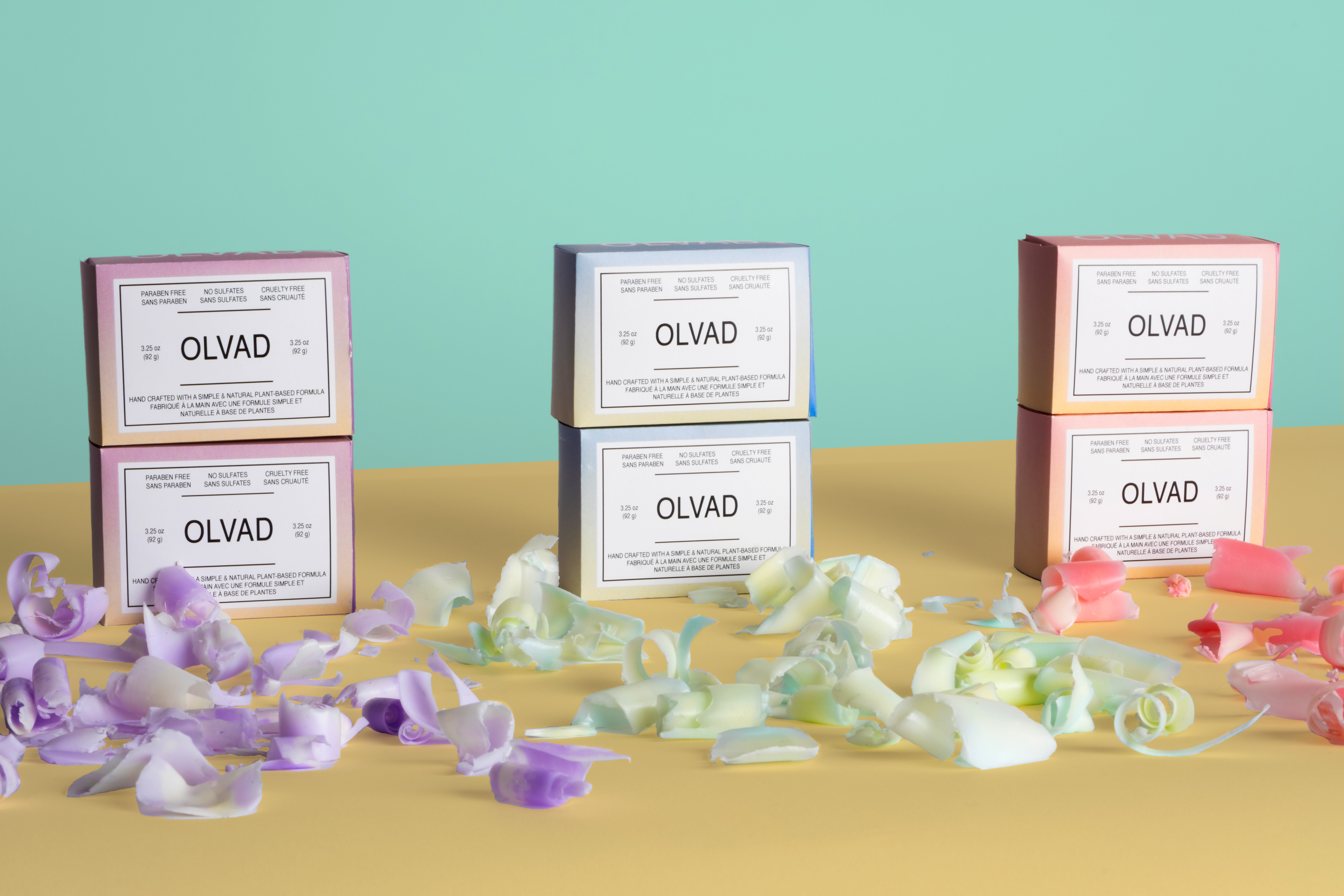
The brand prioritizes sustainability, with its values guiding future goals and decisions. Research into materials and packaging informed design solutions aligned with these principles. To stand out in a competitive market, the brand relies on strong visual identity and effective communication with its target audience. OLVAD offers hygiene products made from simple, natural ingredients that balance environmental responsibility with user benefits. Its bold colour palette differentiates it from more neutral competitors, creating a fun, memorable experience while fostering a positive emotional connection and sense of impact for consumers.

The target audience is health-conscious, young adults who value environmentally responsible products, primarily Gen Z and Millennials. The brand stays relevant through social media marketing and aims to connect with users by offering a unique product experience. Made with natural, plant-based ingredients, each bar features a distinct swirling design created during production, ensuring no two are identical. This variation reflects the brand’s emphasis on individuality in beauty.
Lead designer & creator: Greg Gulyas
Software: Indesign, Illustrator, Photoshop, Blender.
Hardware: Fujifilm X-T4 with 16-80mm lens in a studio environment.


The process for this project was iterative, beginning with developing the brand and assets, including die-lines and layouts using mathematical precision. Storyboarding and planning guided the motion graphic to meet all deliverables effectively. Research into beauty standards and psychology informed the concept that no two individuals are the same and encouraged exploration into new media like soap crafting. The colour palettes, scents, and pouring techniques work together symbiotically, emerging through hands-on experimentation.
The results demonstrate professional-level quality for all deliverables within this openly creative project. All deliverables were achieved, and personal goals that were set helped to add to the mock project. Aunique and vibrant atmosphere was considered to showcase the brand's approachability as a new customer within the product photography. The simple composition would speak towards using simple ingredients. The chosen typography in the design would speak to the characteristics found within the brand with its clean sans-serif typeface. OLVAD is a brand that uses colour psychology and principles to relate to its consumers while heavily considering the company's commitment to being eco-friendly in its product and packaging.

Reach out to me at gulyasdesign@hotmail.com if you want to discuss projects, scope, liaise, or if you just wanna chat! That’s cool too!


